Brand Designer/illustrator Ink Alike
Timeline: 6 weeks ▼ Team: 1 Designer, 1 Founder ▼ Tools: Illustrator, photoshop, InstagramProject details 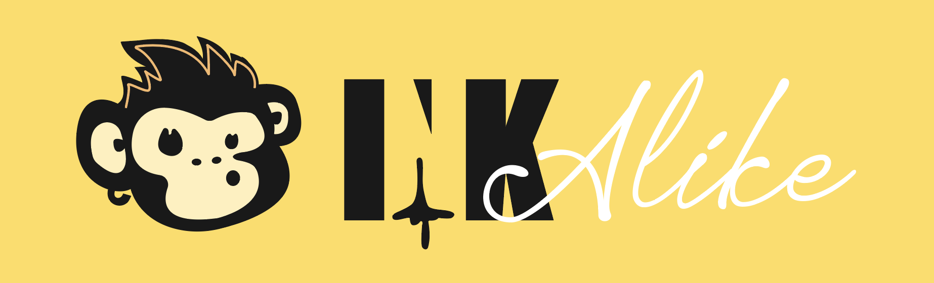
ProblemInk Alike needed a brand identity that stood out in a crowded tattoo market while feeling approachable, playful, and memorable. Many tattoo brands lean intimidating or overly traditional, which can alienate first-time customers.
Challenge Create a visual identity that balances edge and personality while making the brand feel modern, welcoming, and fun.
My role
Led the full brand identity development from concept to execution.
Developed brand visuals that reflected the shop’s personality and appealed to a wider audience.
Created supporting social media assets to establish a cohesive digital presence.
Designed the logo system, typography direction, and color palette.
approach
research & discovery Reviewed competitor tattoo shop branding to identify common visual patterns and opportunities to differentiate.
Identified opportunities to appeal to both tattoo enthusiasts and first-time clients.
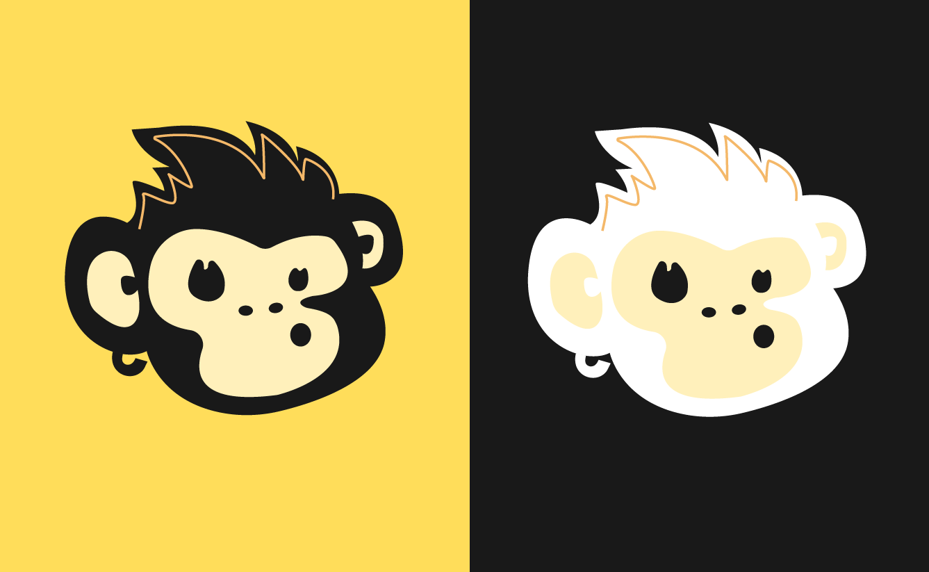
Ideation & ConceptingIntroduced the monkey mascot to add charm, energy, and memorability to the brand.
Used negative space within the word “Ink” to create a more ownable and clever logo mark.
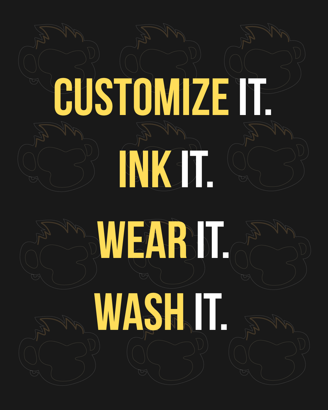
design & iterationCreated branded social media templates and promotional graphics for consistent content creation.
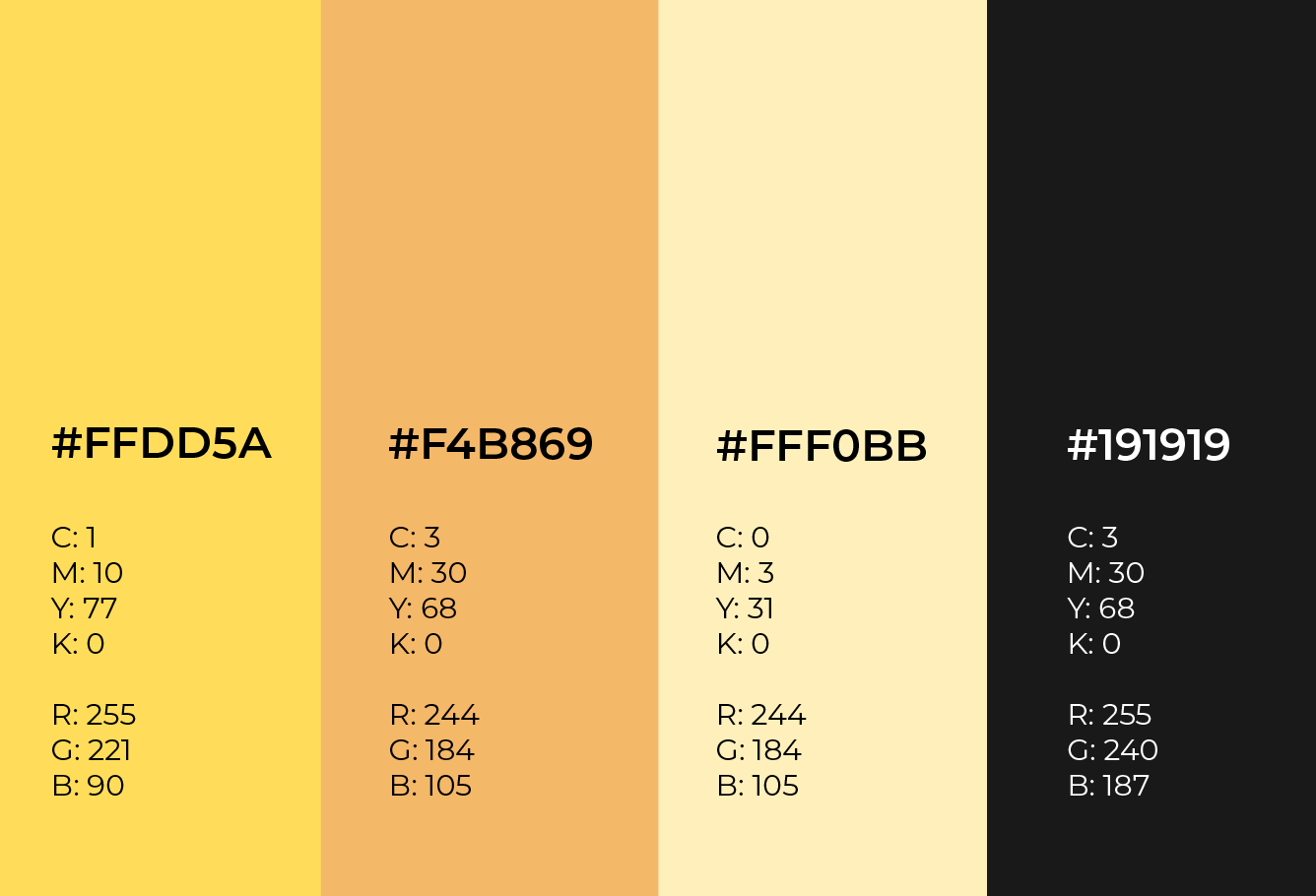
Developed a custom color palette that balanced boldness with warmth and approachability.
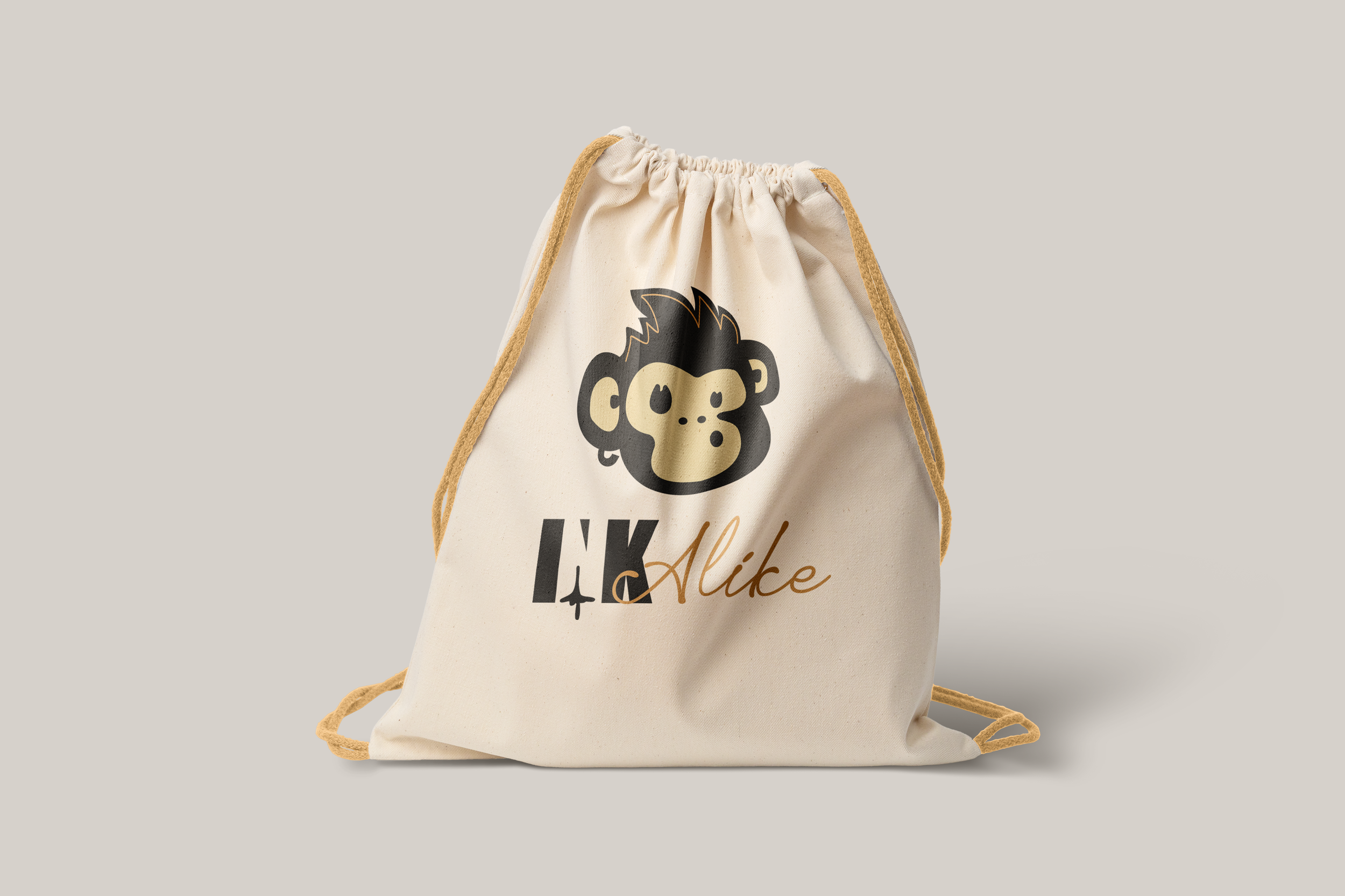
final designStrong, memorable color palette that stands out across print and digital touchpoints.
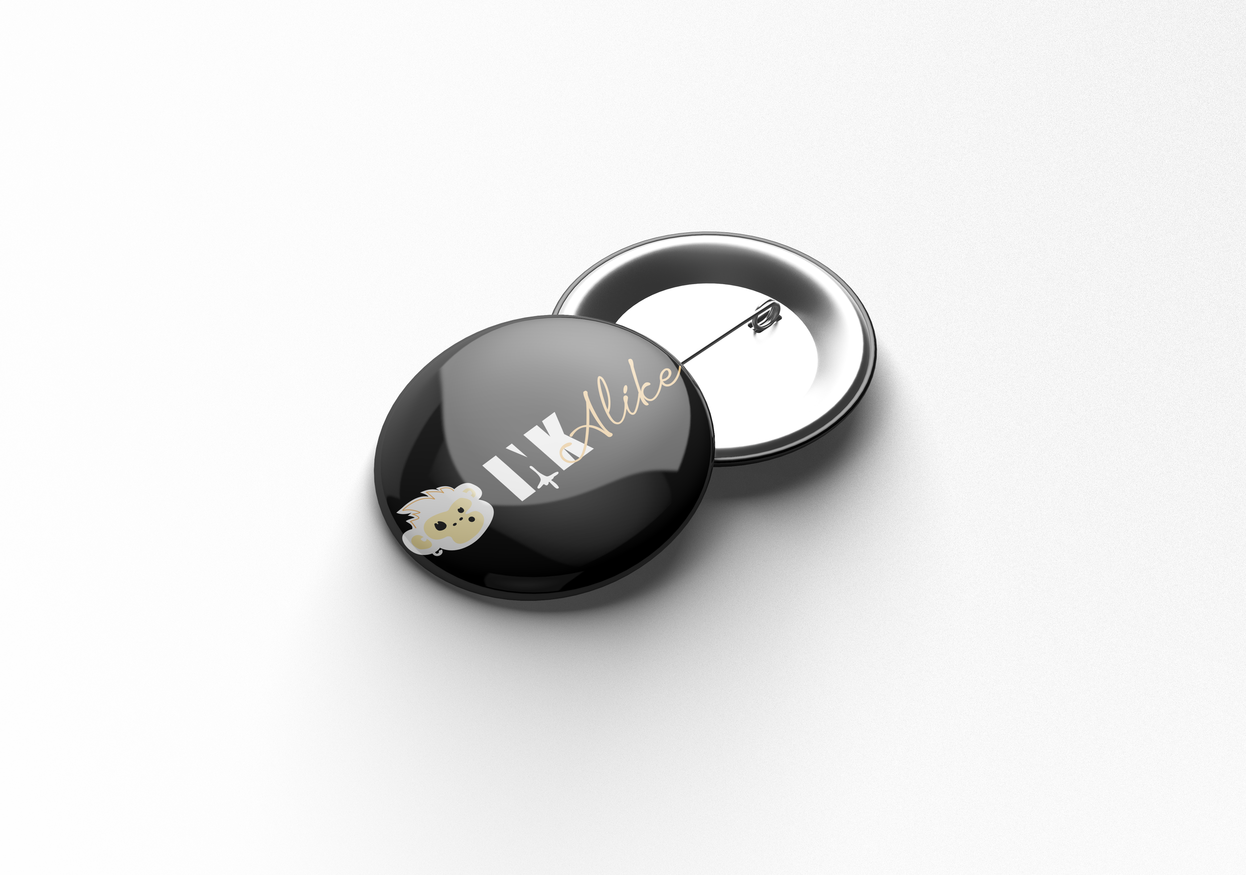
Distinctive logo system featuring playful character elements and smart negative space.
Social media visuals that helped extend the personality of the brand online.


Established a recognizable identity that differentiated Ink Alike from local competitors.
Delivered a flexible visual system that supported marketing, promotions, and growth.
Increased brand consistency across social media and customer-facing materials.
outcome 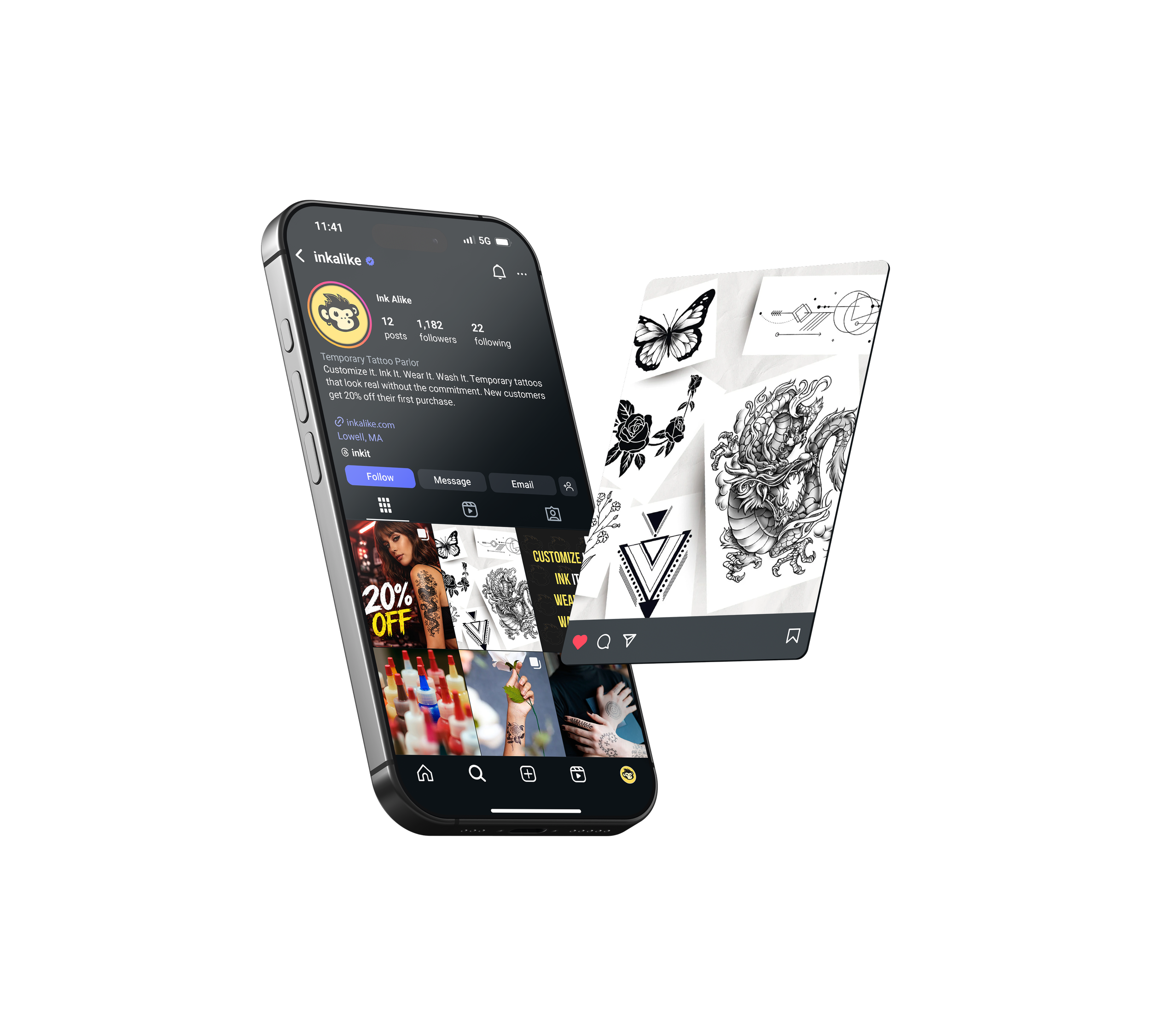
Playful visual elements, when used strategically, can create strong emotional connection.
Small details like negative space can elevate a logo from standard to memorable.
key takeaways